Inside SK: History of SK Brand and Wings of Happiness
Established as a small textile factory in Suwon 1953, SK has never stopped growing in the last 66 years. It has made revolutionary changes in Korean people’s clothing habits, produced energy that drove the Miracle on the Han River throughout the industrialization era, and led Korea as an IT powerhouse in the Information era. You will find in this article the history of SK name, SK brand identity (CI), and its symbol, the ‘Wings of Happiness.’
SK Brand History
SK’s corporate identity has changed and evolved with the times. Since its establishment until the mid 80’s, ‘선경(鮮京)’ was used as a logo. From the mid 80’s, the ‘SUNKYONG’ logo was embodied on the image of the rising sun to demonstrate the company growing into a global leader.
The corporate brands, once had been divided into Sunkyong, Yukong, and Korea Mobile Telecom, were incorporated into ‘SK’ in 1997. In 2005, the SK brand’s identity system was defined with ‘happiness’ as its core value. SK’s representative symbol, the ‘Wings of Happiness,’ was developed and is used as a symbol of this value.
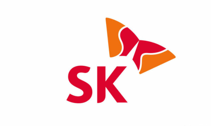
SK Brand Identity encompassed in the corporate identity
SK’s key brand identity is ‘customer happiness.’ SK’s corporate identity consists of a logo which is a lettering of ‘SK’ in a custom English font and a symbol named as the ‘Wings of Happiness.’ Colors used are red and orange.
Symbol, the ‘Wings of Happiness’
The ‘Wings of Happiness’ takes kites and communications as motifs to demonstrate SK’s axes of growth - energy, chemicals, ICT, semiconductors- soaring up high. It is SK’s face reflecting SK’s adventurous spirit into the world and its willpower on the pursuit of happiness.
Reflecting the meaning of flying-up (飛上), the image is tilted in order to describe the sense of adventure (angle requirement: 29.4 degrees) while white lines on the ‘Wings of Happiness’ represent SK’s ‘S’ and ‘K’.
SK Logo
SK logo uses the curvy and soft Bliss Bold font. Its simple shape allows easy reading. In addition, the edges of ‘S’ and ‘K’ are curved and softened to give space between the letters so that their figurative characteristics deliver a soft and friendly image.
More News
For the Press
U.S. Media Contacts
Joe Guy Collier
347-899-1587 Tel
joeguycollier@sk.com
Press Kit
General information and other materials are available for members of the media. Download our media fact sheet.